31 July 2006
28 July 2006
ceramic motifs
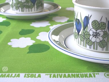 you can take inspiration from the past with these vintage swedish and finnish motifs that are online via japan at scandinavia stock .

27 July 2006
japanese designer


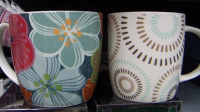
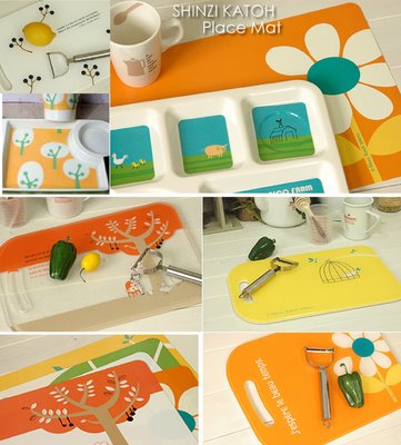
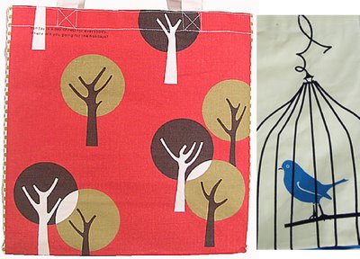 today im looking at the work of top japanese designer - shinzi katoh. shinzi is one of the worlds best known zakka designers, and it seems as though there are few products he cannnot turn his hand to. there are ceramics, bags, glasses, towels, fabrics, and more. for those unfamilar with the term 'zakka', its often difficult to put into english, but it means all the 'small, various products used in everyday life', which encompasses household goods, daily necessities and sundries.lately, zakka has come to represent a style of art and craft that is simple, charming, and of Japanese esthetic. shinzi has his own website here at pumpkin family.




26 July 2006
galbraith & paul


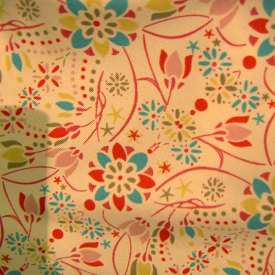
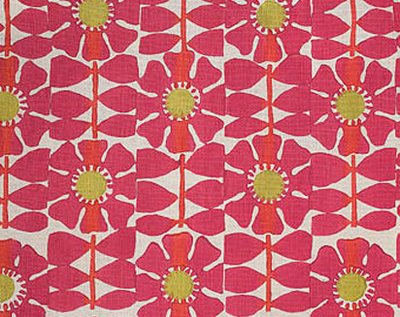
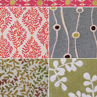
 when i first heard about galbraith & paul , it was long before i was blogging. so it was great to be reminded about them by P+P reader johanna.the patterns are so good that we have to feature them here. the duo Liz Galbraith & Ephraim Paul have been creating designs for 10 years now, and are renowned for their hand blocked fabrics and lighting. the designs are beautiful especially the florals, and the hand printed look makes them so unique.

graphic design

 the new next directory has arrived, remember the cool floral design of the spring/summer book here ?well the autumn/winter cover has gone for leaves (above).
its quite a dark design using a gradient effect.the cover of this catalogue is a good barometer of graphic design trends.
(pictured right is the co-ordinating box they send it out in.)


