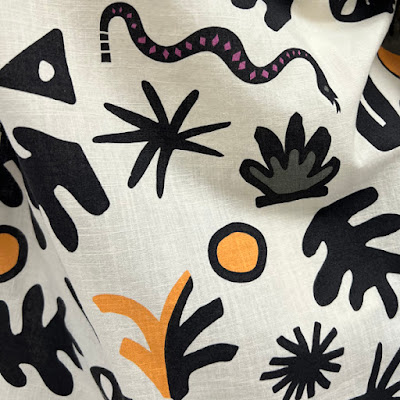
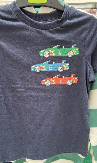
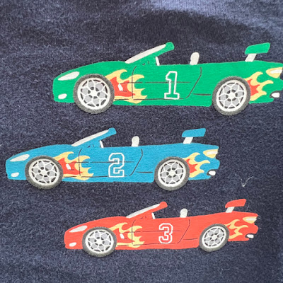
Time for part 2 of our look at Marks & Spencer kids design. Today the focus is slightly more towards boys design, including this painterly pattern (below) which struck me as something quite fresh in boyswear, and above a fine example how to make a fish look cute, friendly and fun!


No comments:
Post a Comment