


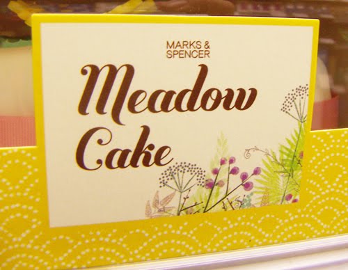
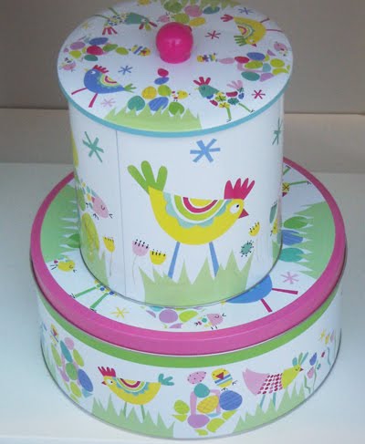
 i can always rely on marks & spencer to come up with an interesting and stylish easter campaign. this year they have been working with wonderful illustrator jane ormes to create a design identity thats looks both delicate and hand drawn whilst still being colourful and appealing. here are some examples of marks & spencer's store displays, packaging and gifts.


5 comments:
i brought my kids some of the bunny biscuits & as my 3 year was about to eat one she turned to me & said 'i can't eat it, it's just too cute" & so she didn't, she refused to eat any of them! {they were rather yummy too}
this work is just gorgeous.
love Jane Ormes work makes me want to buy the whole range so I can keep the packaging!
These are wonderful--even for adults like me!
I love these Easter designs, they are so bright and happy, signalling the forthcoming Spring and Summer months! Wonderful. Easter is a wonderful time of year and these colours bring out the true spirit of this holiday. Thank you for sharing!
Post a Comment